##Loading Data and Packages
suppressPackageStartupMessages(library(tidyverse))
suppressPackageStartupMessages(library(plotly))
library(sf)
## Warning: package 'sf' was built under R version 4.1.2## Linking to GEOS 3.9.1, GDAL 3.4.0, PROJ 8.1.1; sf_use_s2() is TRUElibrary(modelr)
df_311 <- read_csv(here::here("dataset-ignore", "311_data.csv"))## Rows: 273951 Columns: 29## ── Column specification ────────────────────────────────────────────────────────
## Delimiter: ","
## chr (20): ontime, case_status, closure_reason, case_title, subject, reason,...
## dbl (6): case_enquiry_id, fire_district, city_council_district, neighborho...
## dttm (3): open_dt, target_dt, closed_dt##
## ℹ Use `spec()` to retrieve the full column specification for this data.
## ℹ Specify the column types or set `show_col_types = FALSE` to quiet this message.clean_311 <- read_csv(here::here("dataset", "clean_311_data"))## Rows: 50000 Columns: 18## ── Column specification ────────────────────────────────────────────────────────
## Delimiter: ","
## chr (14): ontime, case_status, case_title, subject, reason, type, queue, de...
## dbl (1): fire_district
## date (3): open_dt, target_dt, closed_dt##
## ℹ Use `spec()` to retrieve the full column specification for this data.
## ℹ Specify the column types or set `show_col_types = FALSE` to quiet this message.clean_311$closed <- ifelse(clean_311$case_status %in% c("Closed"), TRUE, FALSE)
clean_311$duration <- difftime(clean_311$closed_dt, clean_311$open_dt, units = "days")##Exploratory Data Analysis
First, we are creating a map of the neighborhoods in Boston, colored by the number of 311 BPD cases in each neighborhood.
police_info <- df_311 %>%
  filter(subject %in% c("Boston Police Department")) %>%
  select(neighborhood, longitude, latitude) %>%
  st_as_sf(coords = c("longitude", "latitude")) %>%
  st_set_crs(4326) %>%
  st_transform(26986)

bos_neighborhoods <- st_read(here::here("dataset/Boston_Neighborhoods", "Boston_Neighborhoods.shp"), quiet = TRUE) %>%
  st_transform(26986)

plot_1 <- st_join(bos_neighborhoods, police_info) %>%
  group_by(Name) %>%
  summarize(n = n()) %>%
  ggplot(aes(fill = n, text = paste(Name))) +
  geom_sf() +
  labs(title = "Map of Neighborhoods Colored by Number of BPD Cases") +
  scale_fill_viridis_c()

ggplotly(plot_1, tooltip = "text")
We find that different departments are being charged for the same type of case. Therefore, we calculate the average time for different departments charging for the same issue and the cases closing rate by the department. Then, we created the plot of the department against the Meantime and department. We found that the Public Works and Transportation Department department took charge of most cases, which is about 70% of the 50000 cases. Also, we found out that the department taking more cases will tend to have higher cases closing rate, while both the Public Works department and Transportation Department have about 95% case closing rate. The average duration across the different departments is almost the same, and the department with the smaller number of cases tends to have a shorter average closing duration. Therefore, assigning the same case to a different department may affect its duration and final status.
department_name <-
  list(
  department = c("PWDx", "BTDT", "INFO", "ISD", "PARK", "PROP","BWSC", "DISB", "No Q", "BPS_", "HS_O", "ANML","HS_D", "CHT_", "HS_W", "HS_V", "HS_Y"),
  department_n = c("Public Works", "Transportation Department", "Information Channel (Not a department)",
                   "Inspectional Services", "Parks", "Property Management"," Water and Sewer Commission",
                   "Disability Commission", "No queue assigned (Not a department)", "Boston Public Schools",
                   "Housing, Office of Civil Rights", "Animal Control", "Disabilities/ADA","City Hall Truck",
                   "Women’s Commission","Veterans Call log", "Youthline")) %>% as_tibble()

department_g <- clean_311 %>%
  group_by(department) %>%
  summarise(n = n(), closing_rate_dep = (sum(!is.na(duration))/n)) %>%
  left_join(department_name, by = c("department"))

difference <- clean_311 %>%
  group_by(type, subject, department) %>%
  summarise(
    meantime = mean (duration, na.rm = TRUE),
    case = n(),
    closing_rate = (sum(!is.na(duration))/case)
  ) %>%
  left_join(department_g, by= c("department"))
## `summarise()` has grouped output by 'type', 'subject'. You can override using the `.groups` argument.difference %>%
ggplot(aes(x = factor(department))) +
geom_boxplot(aes(y = meantime)) +
geom_point(aes(y = closing_rate_dep* 300, color = "closing rate"), shape = 9) +
labs(
x = "Department",
color = "Legend",
title = "Boxplot of Meantime by Department",
subtitle = "Points represent average closing rate for each department"
) +
scale_y_continuous(
name = "Meantime",
limits = c(NA,NA ),
sec.axis = sec_axis(trans = ~. /300, name = "Closing Rate by Department ")
) +
theme(axis.text.x = element_text(angle = 35))## Warning: Removed 98 rows containing non-finite values (stat_boxplot).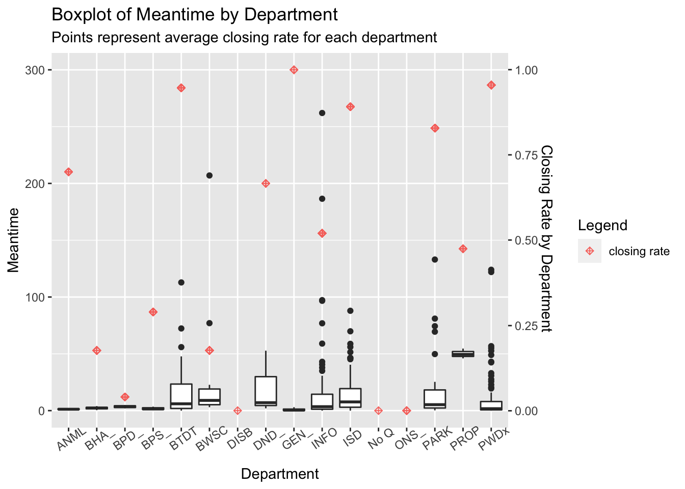
##Statistical Modeling
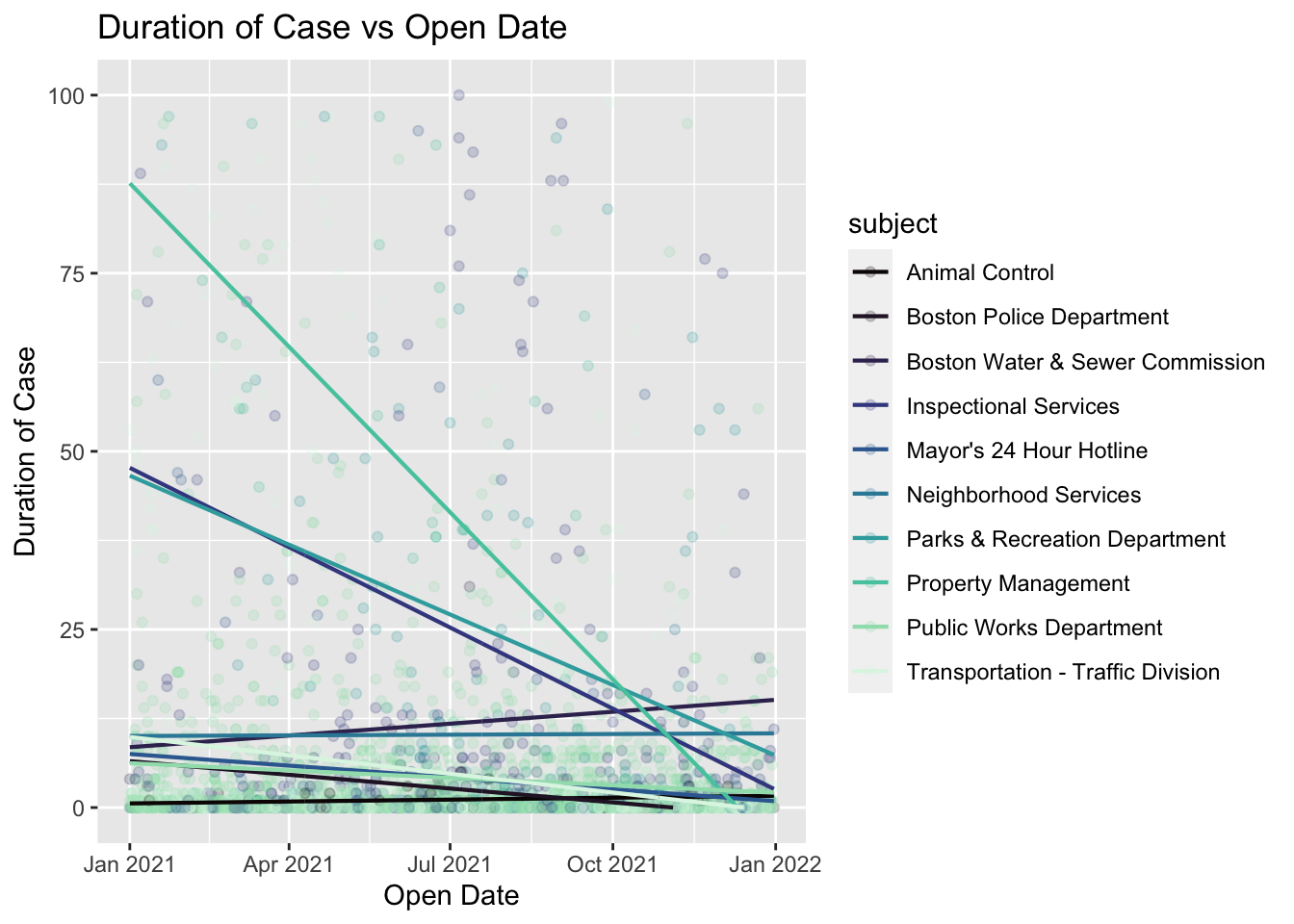
We next create a linear model for duration with parameters open_dt and subject, including an interaction term. This gives us insight into the relationship between the duration of a case and the day of the year it was opened, as well as the relationship between duration and the subject of the case. The interaction term accounts for how duration varies with both subject and open_dt (i.e. some departments show a more negative relationship between open_dt and time than others). We then create a scatterplot of 5000 randomly selected cases and plot the lines of regression corresponding to our linear model.
lm_1 <- lm(duration ~ open_dt * subject, data = clean_311)
coef_1 <- coef(lm_1)

grid <- clean_311 %>% data_grid(open_dt, subject) %>% gather_predictions(lm_1)

clean_311 %>%
  sample_n(5000) %>%
  ggplot() +
  geom_point(aes(x = open_dt, y = duration, color = subject), alpha = 0.2) +
  geom_line(aes(x = open_dt, y = pred, color = subject), data = grid, size = 0.75) +
  scale_y_continuous(limits = c(0,100)) +
  labs(
    x = "Open Date",
    y = "Duration of Case",
    title = "Duration of Case vs Open Date"
    ) +
  scale_color_viridis_d(option = "G")
## Warning: Removed 629 rows containing missing values (geom_point).## Warning: Removed 95 row(s) containing missing values (geom_path).